100Plus

I joined 100Plus as the company's first designer at the beginning of 2020. While challenging, this put me in an ideal position to lead the company's branding, marketing, and product offerings.
- User Research
- User Experience
- Creative Direction
- App Design
- Website Design
- WEbsite Development
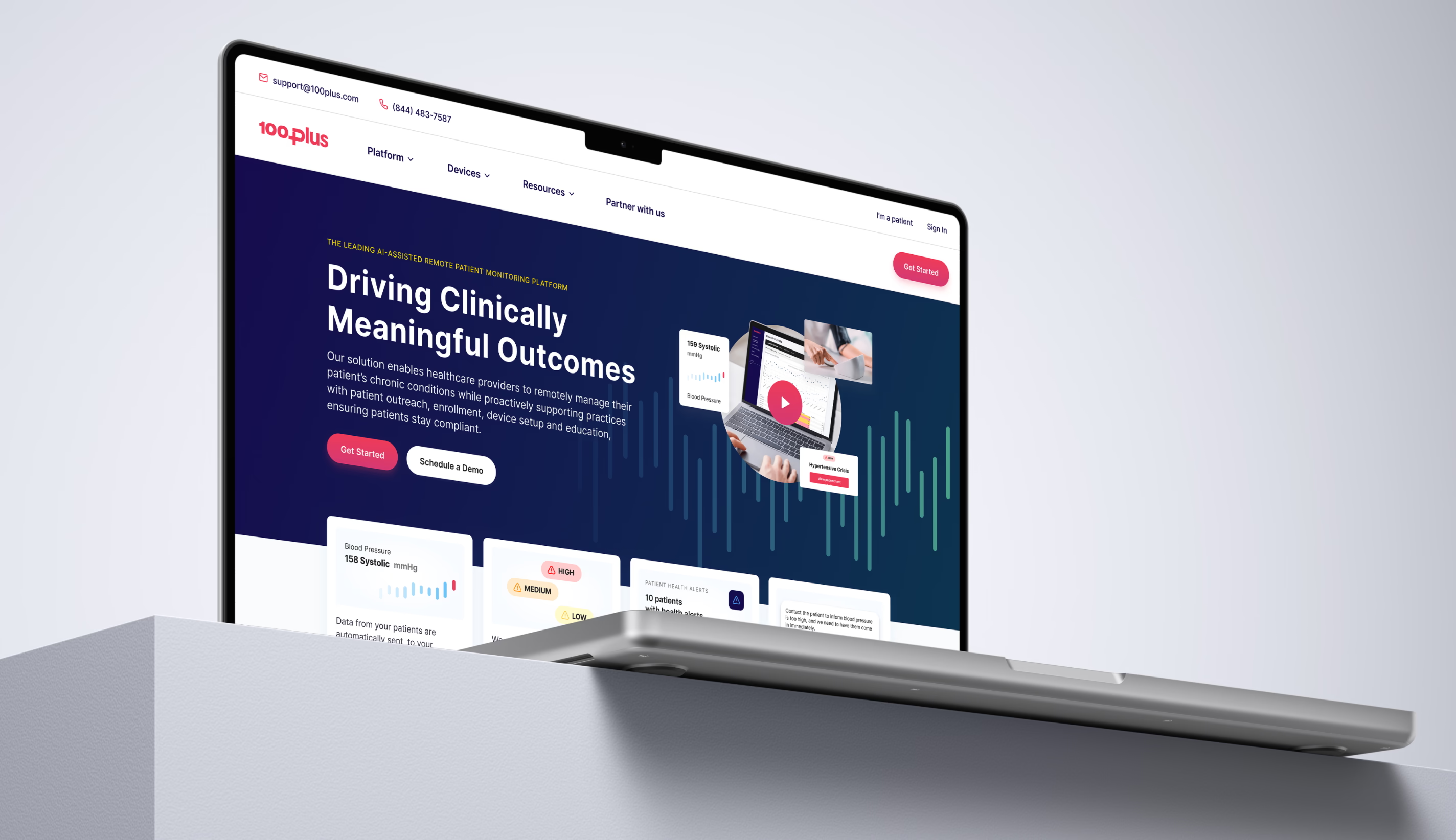
100Plus is the leading AI-assisted Remote Patient Monitoring platform for physician practices.
Driving Better Patient Outcomes
The provider portal had an initial version in use but it lacked meaningful usability and a robust feature set because early work focused primarily on infrastructure rather than experience. To remain competitive, 100Plus needed to scale quickly and deliver a more capable platform for healthcare providers managing chronic care. As lead designer, I set out to understand provider needs, improve usability, expand functionality, and streamline collaboration across teams to speed development.
Working closely with product and engineering, I conducted research through interviews, surveys, and usability testing, turning insights into an iterative roadmap. I designed and prototyped solutions in Figma, built a design system for long-term consistency, and rolled out features such as alert thresholds, review timers, call logging, and clinical notes. The improved portal became a high-performing clinical tool that helped drive a ten-fold increase in ARR within two years, with 94 percent of providers reporting improved blood pressure control and 69 percent reporting reduced hospitalizations and other high-acuity events.

Patient Trust and Engagement Through Transparency
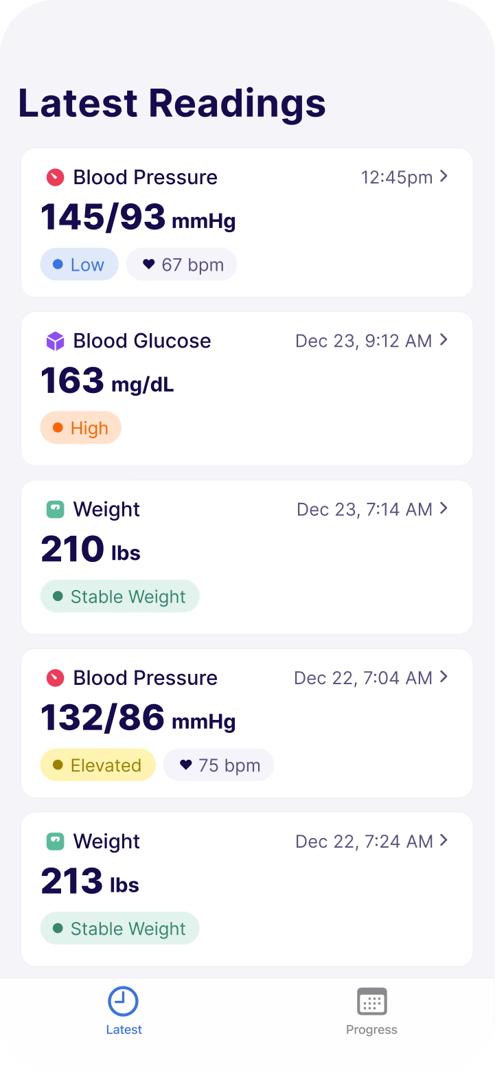
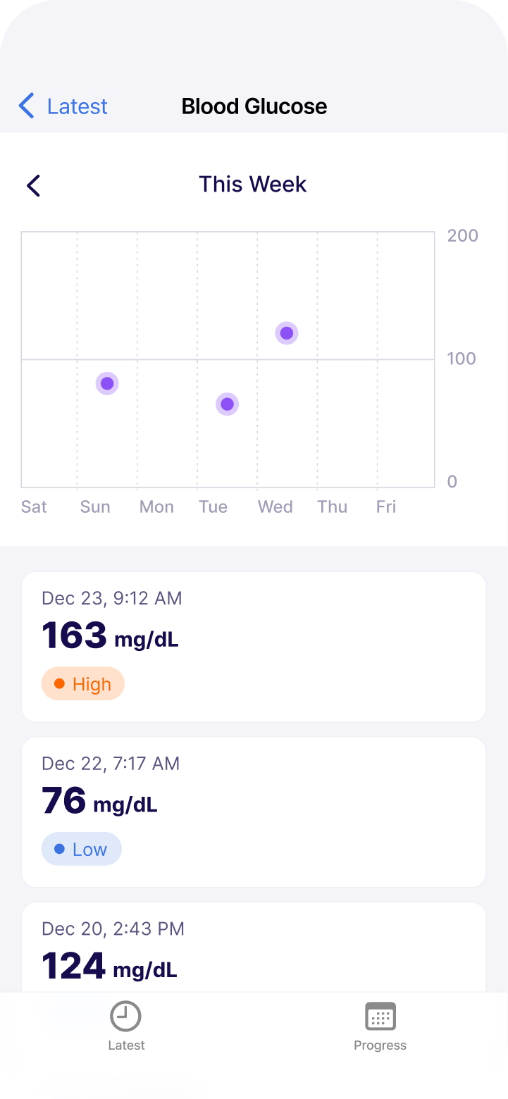
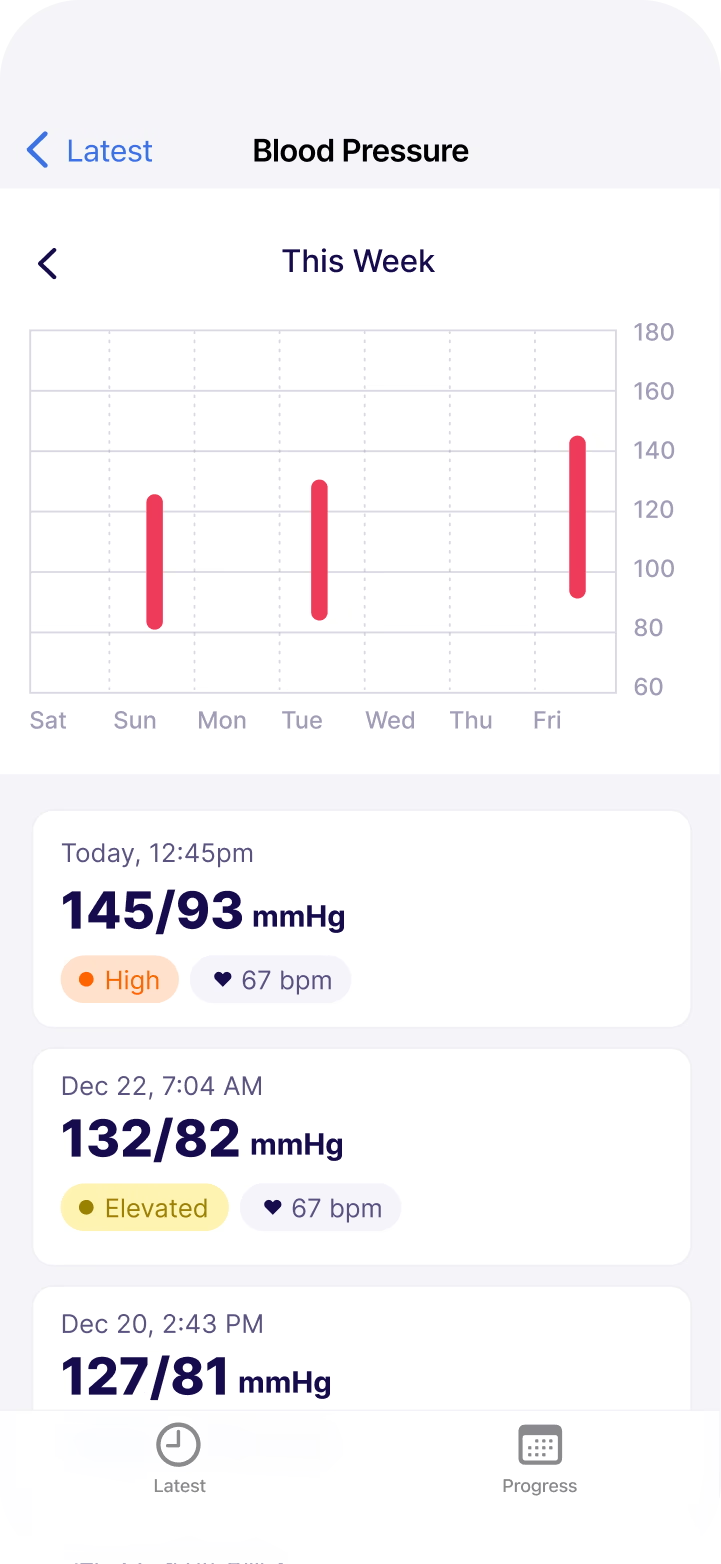
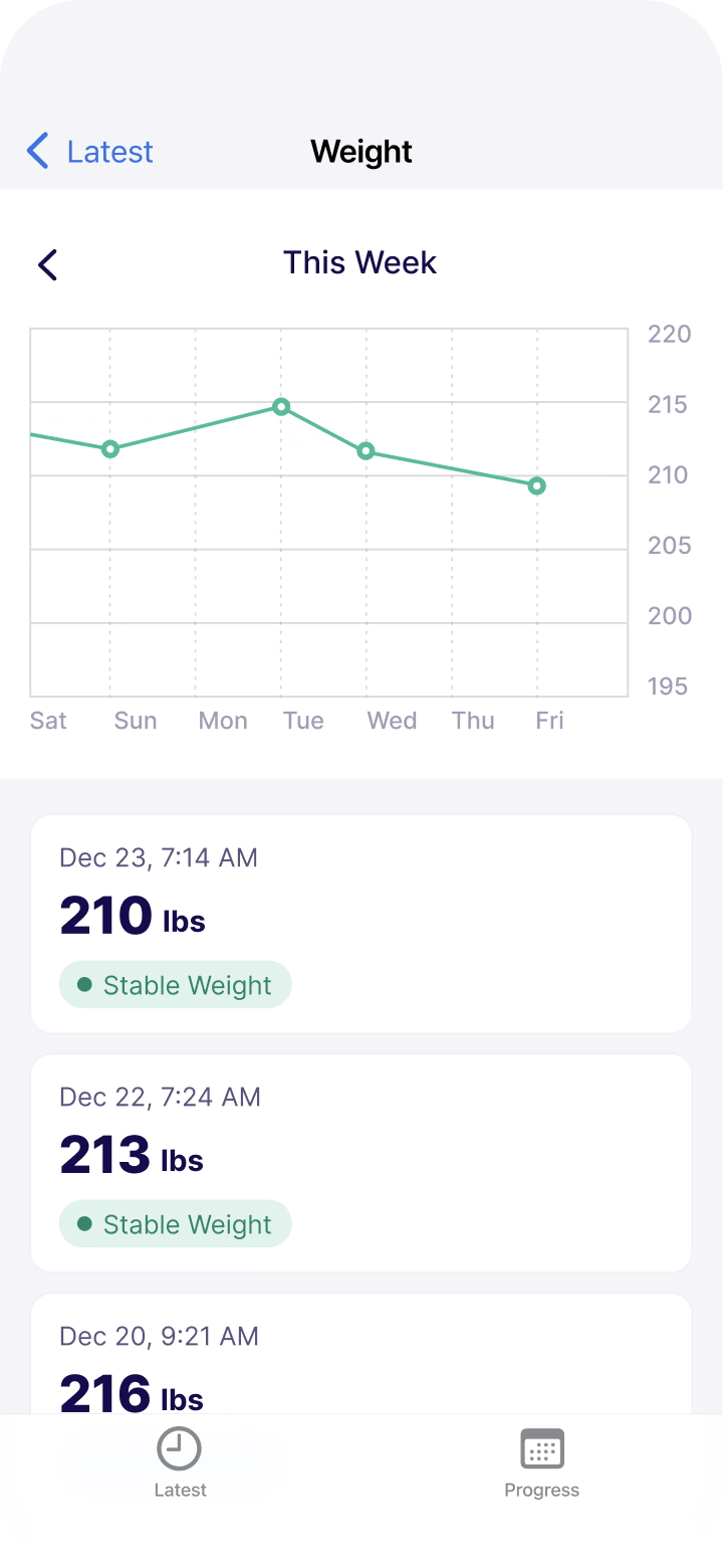
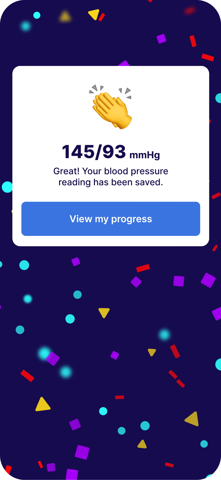
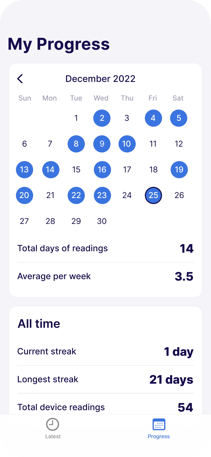
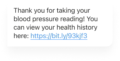
Patients monitored their health through devices that only displayed the most recent reading and offered no way to view historical results, which created uncertainty about whether their data was being shared with their care team. Many patients felt anxious about their progress and began to distrust the system, which led to lower compliance and an increase in support calls. I was asked to design the first version of a patient-facing portal for more than 30,000 patients across 426 healthcare practices, with the intention of allowing them to review their reading history, feel confident in the technology, increase testing frequency, and ultimately improve health outcomes.
I created and tested a mobile-first web experience using Figma and gathered feedback from multiple angles, including internal testing with employees using real devices, support teams promoting the portal during live calls, offline testing with friends and family, and direct phone conversations with patients who were willing to share their experiences. Higher patient adherence became a shared win for both providers and 100Plus because consistent testing led to improved patient results, and increased billable activity that supported the sustainability of the product and its partners.
open rate, the highest of any channel
More readings than patients who do not receive automated messages
Reduction in the incidence of hospitalizations and other forms of high acuity care

Empowering Physicians
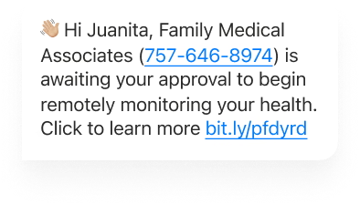
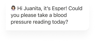
The 100Plus solution includes Esper, a powerful AI-assisted technology that acts as a virtual physician assistant to enable better care coordination and patient engagement.

More Work

